Components
File upload
File upload is a form element used to upload files.
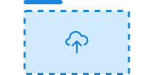
File upload is under development. If you have feedback or suggestions, please report them on Github or in Slack.
Unable to parse html
const PreviewEn = () => (
  <Field>
    <Label>Upload profile picture</Label>
    <Field.Description>
      File must be in csv format and less than 2MB
    </Field.Description>
    <EXPERIMENTAL_FileUpload>
      <Field.Description>Drop file here</Field.Description>
      <Button asChild data-variant='secondary'>
        <span>Upload file</span>
      </Button>
      <input type='file' />
    </EXPERIMENTAL_FileUpload>
  </Field>
);

render(<PreviewEn />)
Usage
Place File upload inside a field with a label so the upload area gets an accessible label.
In plain HTML, use the class ds-file-upload on an element that contains an <input type="file">. The input is placed on top of the whole area so the entire surface becomes clickable.
To make the area read-only, set readonly on the input. The component then automatically switches to a neutral color scale and disables interaction.
CSS variables and data attributes
File upload uses its own CSS variables to control things like background, border, icon and spacing. These can be overridden on .ds-file-upload.
| Name | Value |
|---|---|
| --dsc-file-upload-background | var(--ds-color-surface-default) |
| --dsc-file-upload-background--hover | var(--ds-color-surface-tinted) |
| --dsc-file-upload-border-color | var(--ds-color-border-default) |
| --dsc-file-upload-border-radius | var(--ds-border-radius-md) |
| --dsc-file-upload-border-style | dashed |
| --dsc-file-upload-border-style--hover | dashed |
| --dsc-file-upload-border-width | max(2px, .125rem) |
| --dsc-file-upload-color | currentcolor |
| --dsc-file-upload-icon-color | var(--ds-color-text-subtle) |
| --dsc-file-upload-icon-size | var(--ds-size-8) |
| --dsc-file-upload-icon-url | url('data |
| --dsc-file-upload-icon-url--readonly | url('data |
| --dsc-file-upload-padding | var(--ds-size-7) var(--ds-size-6) |
| Name | Value |
|---|---|
| data-field | description |
React
react-dropzone
react-dropzone is a popular library for creating file upload components in React. Here is an example of how you can use react-dropzone together with FileUpload.
Unable to parse html
const ReactDropZoneExample = () => {
  const MAX_FILES = 3;
  const [files, setFiles] = useState<File[]>([]);
  const [rejected, setRejected] = useState<FileRejection[]>([]);
  const isReadOnly = files.length >= MAX_FILES;
  const { getRootProps, getInputProps, isDragActive, isDragReject } =
    useDropzone({
      onDropAccepted: (newFiles) => {
        setFiles((prev) => {
          const remaining = MAX_FILES - prev.length;
          return [...prev, ...newFiles.slice(0, remaining)];
        });
      },
      onDropRejected: (rej) => {
        setRejected((prev) => [...prev, ...rej]);
      },
      accept: {
        'image/svg+xml': ['.svg'],
      },
      maxFiles: MAX_FILES,
      disabled: isReadOnly,
    });

  return (
    <div style={{ minWidth: '300px' }}>
      {/* When using react-dropzone, it is important to apply the getRootProps to the
        Field component and not the FileUpload component so screenreaders see the Label.
        This should be noted in the docs */}
      <Field {...getRootProps()}>
        <Label>Upload profile picture</Label>
        <EXPERIMENTAL_FileUpload>
          {isReadOnly && (
            <>
              <CircleSlashIcon aria-hidden='true' />
              <Field.Description>
                You can not upload more files
              </Field.Description>
            </>
          )}
          {!isReadOnly && (
            <>
              {isDragReject && <CircleSlashIcon aria-hidden='true' />}
              <Field.Description>
                {isDragReject
                  ? 'File type not accepted'
                  : isDragActive
                    ? 'Drop file(s) here'
                    : 'Drop file(s) or click to upload'}
              </Field.Description>
              <Field.Description>
                File must be <code>.svg</code>, {MAX_FILES - files.length} of{' '}
                {MAX_FILES} files remaining
              </Field.Description>
              <Button asChild data-variant='secondary'>
                <span>Upload file</span>
              </Button>
            </>
          )}

          <input
            {...getInputProps({
              readOnly: isReadOnly,
              'aria-invalid': isDragReject,
            })}
          />
        </EXPERIMENTAL_FileUpload>
      </Field>
      {files.length > 0 && (
        <>
          <p>Accepted files</p>
          <ul>
            {files.map((file) => (
              <li key={`${file.name}-${file.lastModified}`}>{file.name}</li>
            ))}
          </ul>
        </>
      )}
      {rejected.length > 0 && (
        <>
          <p>Rejected files</p>
          <ul>
            {rejected.map(({ file, errors }) => (
              <li key={`${file.name}-${file.lastModified}`}>
                {file.name} — {errors.map((e) => e.message).join(', ')}
              </li>
            ))}
          </ul>
        </>
      )}
    </div>
  );
};

render(<ReactDropZoneExample />)