Get started
Learn how to get started with Designsystemet


Learn how to get started with Designsystemet
See the overview of framework-independent UI components.
Understand how shared patterns contribute to consistent user experiences

Designsystemet is a shared toolkit of framework-independent UI components and guidelines for developing digital services. You can use the full toolkit, or pick the parts that add value in your solution. It is free to use, designed to work with an organisation’s own visual identity, and supports efficient product development and coherent user experiences.
Read more about Designsystemet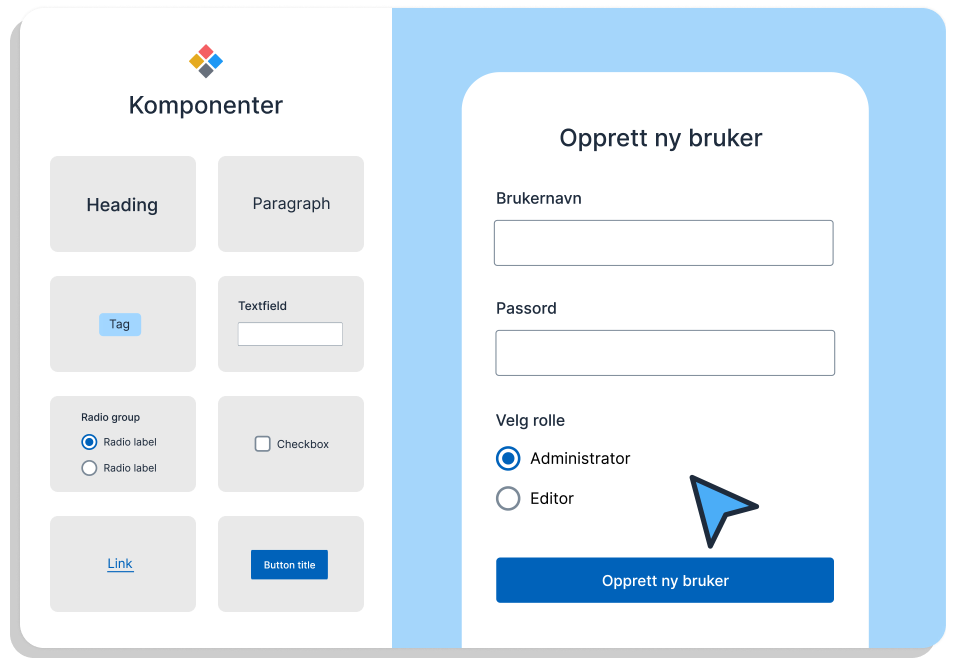
By creating the most basic components once in a common design system, we ensure high quality. Each component is thoroughly tested and meets accessibility requirements. Components are available for Figma, CSS, a framework-independent web package and React. Use the components that add value in your solution, and build on top of them when you need to.
Read more about accessibility
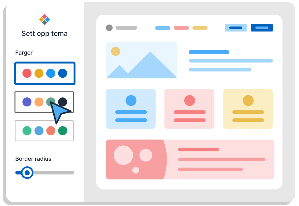
With theming, Designsystemet makes it possible to support different visual identities. You can use the Theme Builder to get started, and build on the theme so it fits your own profile and solution. This means everyone can build on the same design system foundation, while adapting it to different sender identities.
Build your theme

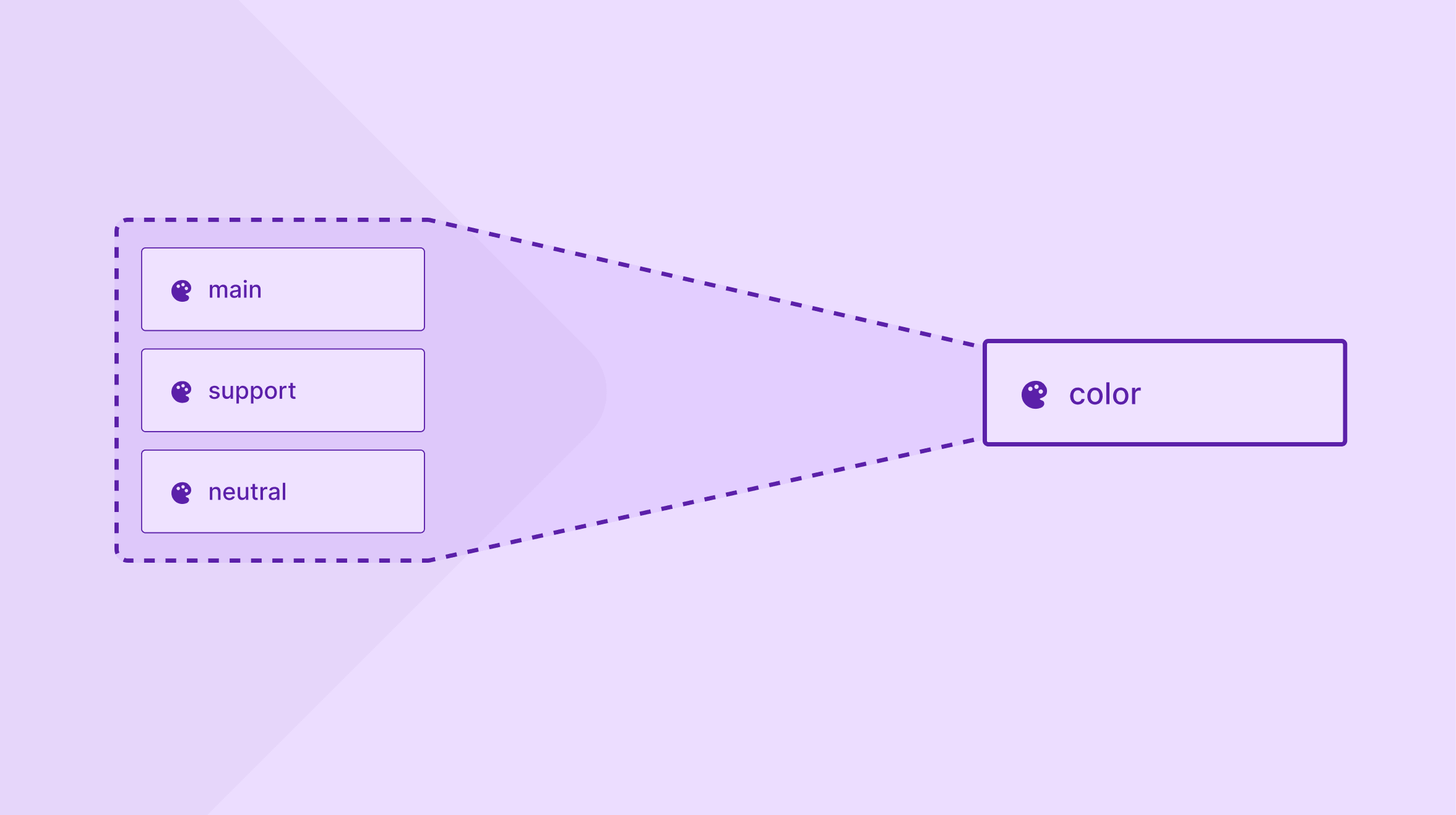
Learn how to migrate your Designsystemet Figma library to the new color structure.
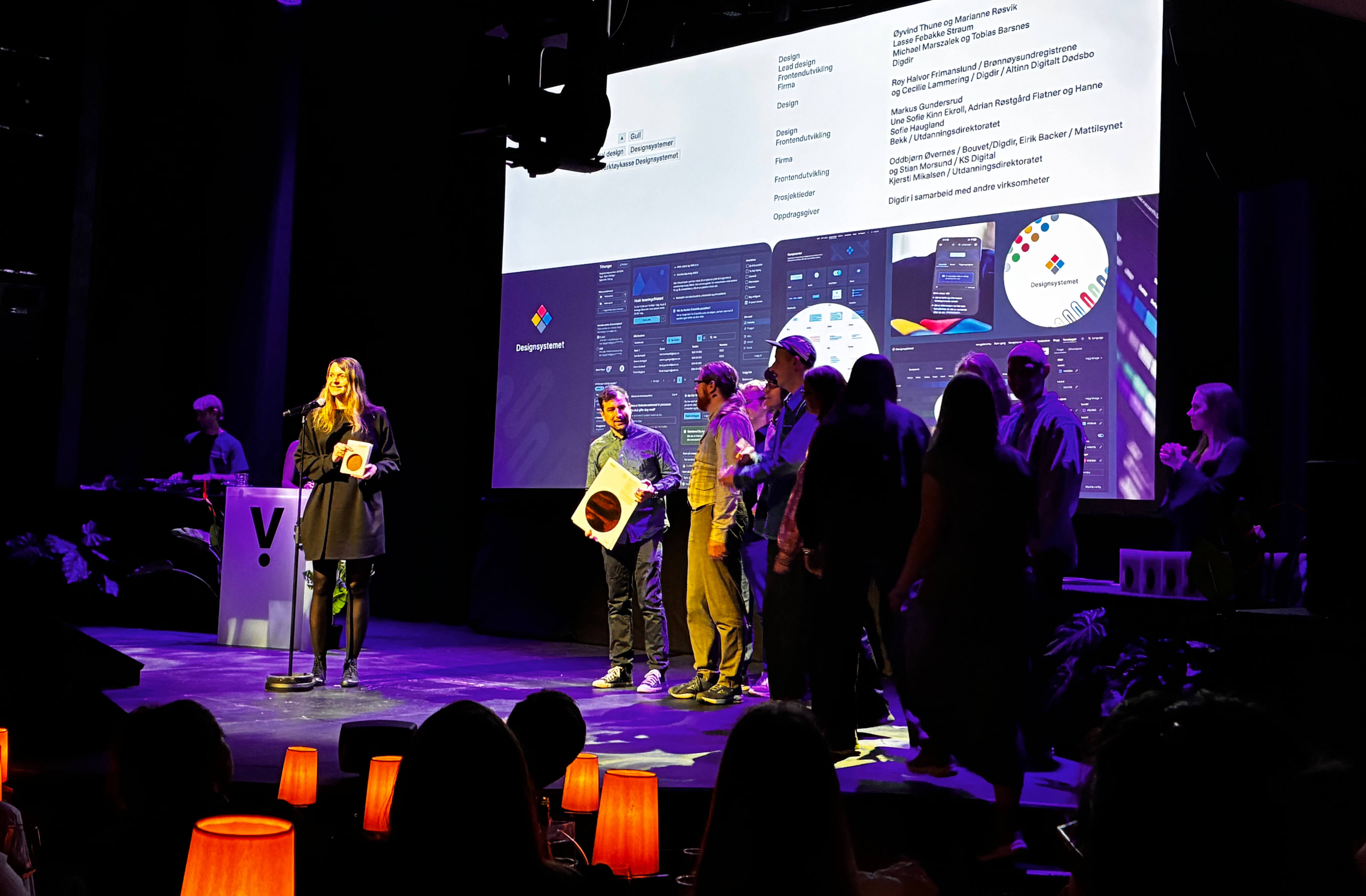
Designsystemet won gold in Digital Design and the IxDA Honorary Award at Visuelt 2026.
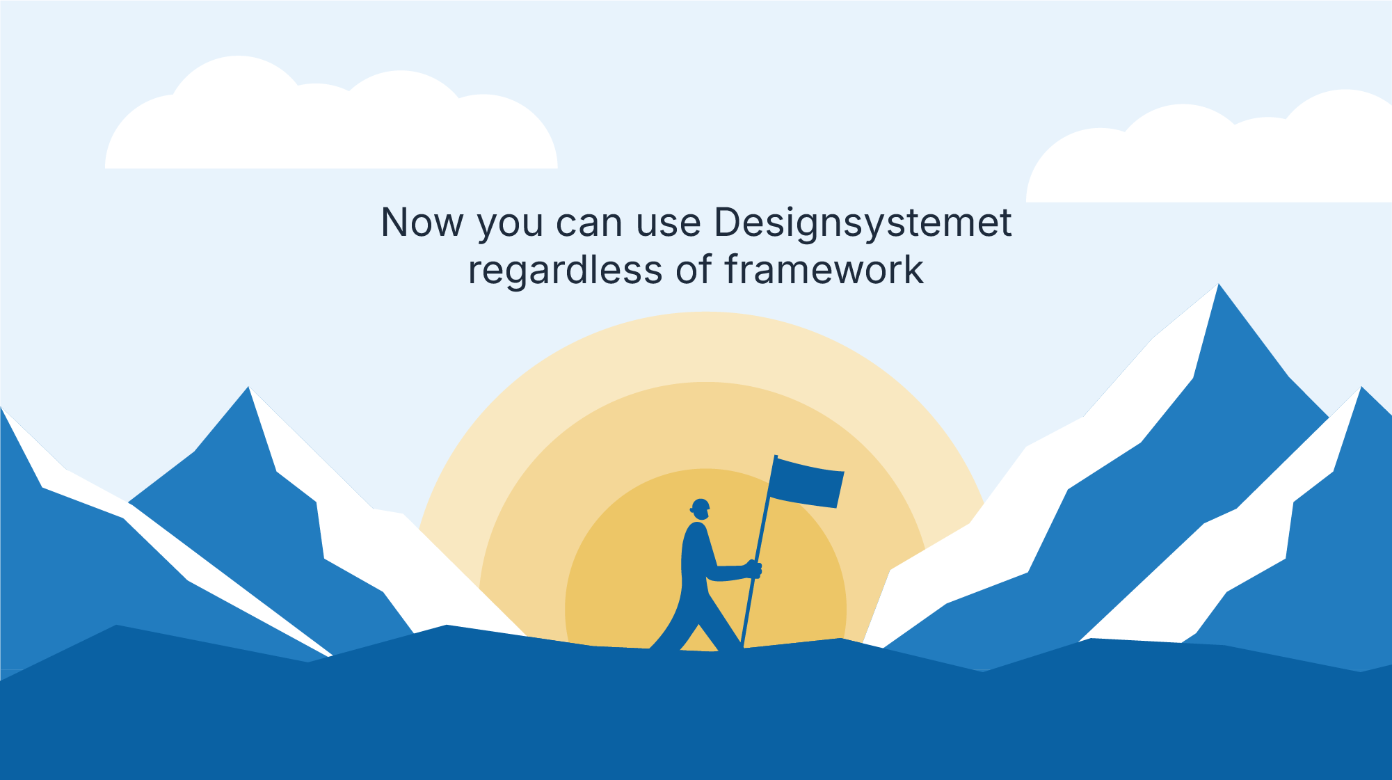
@digdir/designsystemet-web package is now released
A joint effort to improve user experiences across public services. Together we develop a common foundation for good, accessible and holistic digital solutions.

By collaborating on Designsystemet, we can create more recognizable behavior in components and interaction patterns across the public sector. Designsystemet is meant to be a shared home for reusable components, best practices, user dialogue, insights, and more. Want to learn more or get involved? Get in touch!
