Components
Search
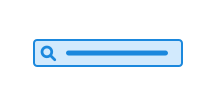
Search allows users to quickly find relevant content on a website or in an application. The component consists of a search field, with or without a search button.
We are working to improve the accessibility documentation for this component. If you have questions or see something that should be prioritised, please contact us on Github or Slack.
Keyboard interaction
- Pressing Esc clears the search field to provide a consistent experience across browsers.
- Tab navigation allows users to move between the input field, the clear button and the search button.
- Enter submits the search when the input field has focus.
Screen reader support
The search field must have an accessible label describing its purpose. The label should normally be visible; if the purpose is clear from context, use a visually hidden <label>, aria-label, or aria-labelledby instead.
Note that a placeholder does not replace a label and should only be used for an optional hint or example. Avoid repeating the same text in the label and the placeholder. Example: Use "Search" as the label and, optionally, "Search for services, forms, or guidance."
Edit this page on github.com (opens in a new tab)