Patterns
Placement, order and language in buttons
How can we create a more predictable and inclusive experience by standardising button placement and order?
Inconsistent placement and order of buttons create unnecessary friction. It increases the risk of errors and makes tasks harder, especially for people with reduced vision, motor challenges or cognitive barriers. When we use the same placement, order and language across solutions, the experience becomes more predictable. Users find their way faster and make fewer mistakes.
Design and experience
Limit the number of buttons
Limit the number of buttons to what the user actually needs in the situation. When each choice is clear and unambiguous, it becomes easier to understand what is happening and safer to click.1
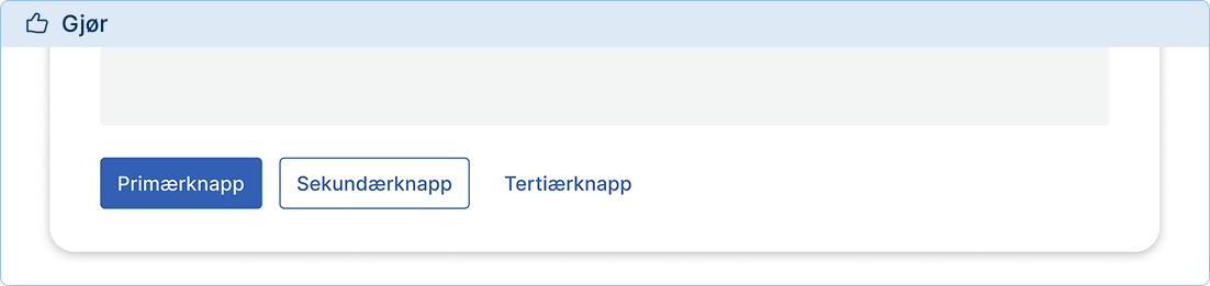
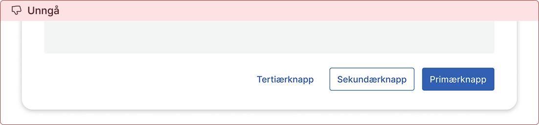
Use the order primary, secondary, tertiary
As a general rule, buttons that appear in a group should always be presented in the order primary → secondary → tertiary.
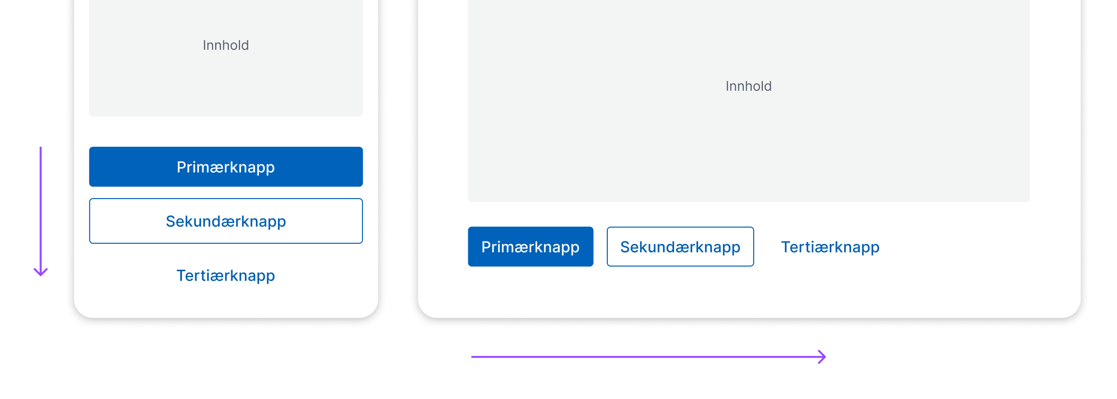
Place buttons to the left
Place buttons to the left in the interface. This makes them easier to find for all users, especially those with reduced visual fields or those using screen magnification.2
Practical examples
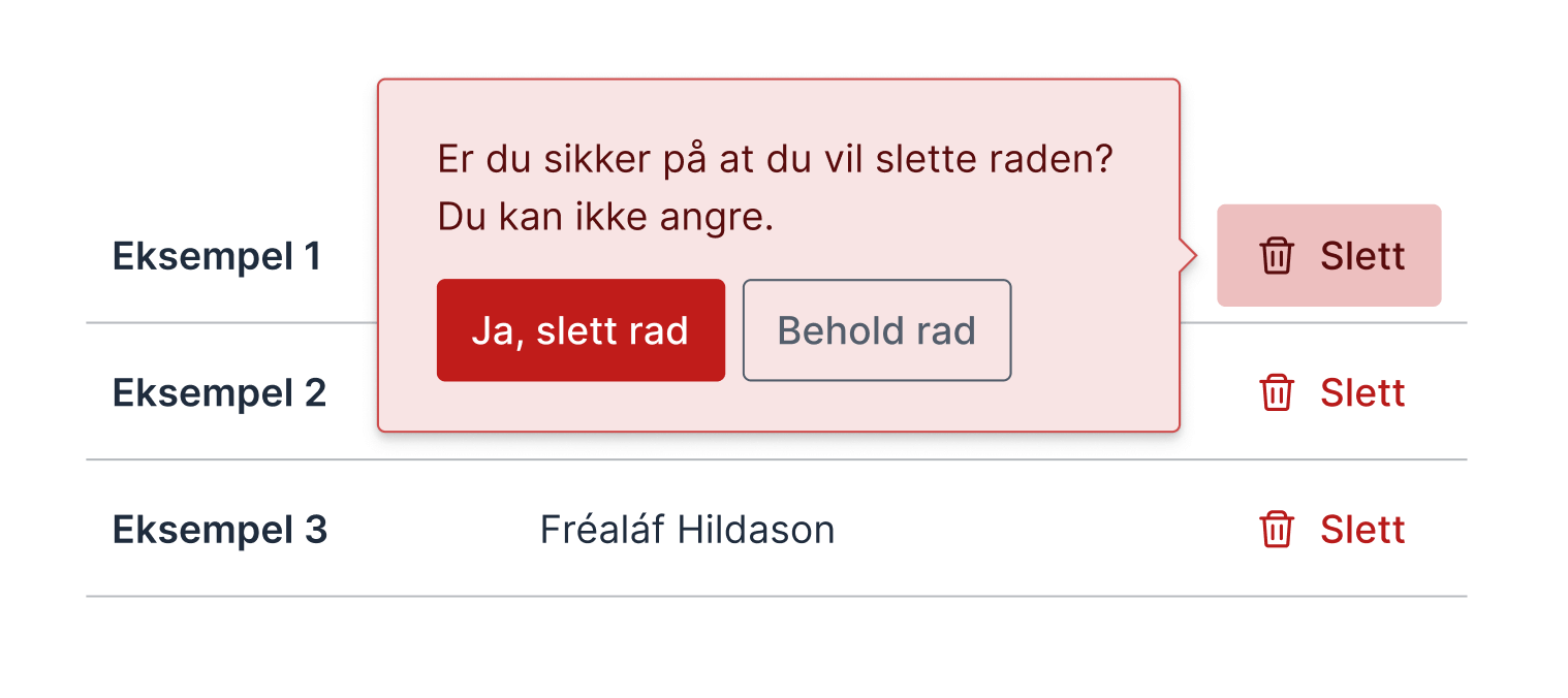
Modal (dialogue)
To create a predictable experience, buttons in a modal should be placed and ordered the same way as elsewhere.
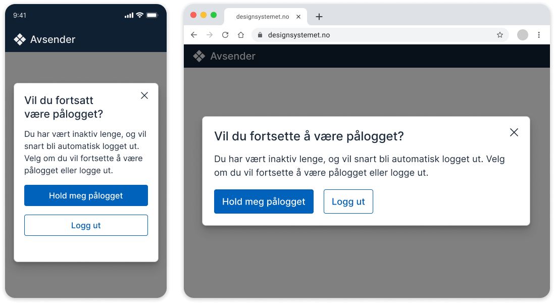
The close button (X) should be placed in the top right corner of the modal. It should have the same function as clicking outside the modal or pressing the Esc key. The modal closes, and if a question requires an answer, it should always fall back to the least intrusive or least destructive option for the user.
Popover
A popover is used for short, limited choices or confirmations that require immediate action without taking the user out of context. Buttons in a popover should follow the same placement and order as elsewhere.
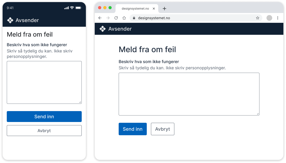
Single-page form
In forms where everything is completed on one page, the “Submit” button will usually be the only primary action.
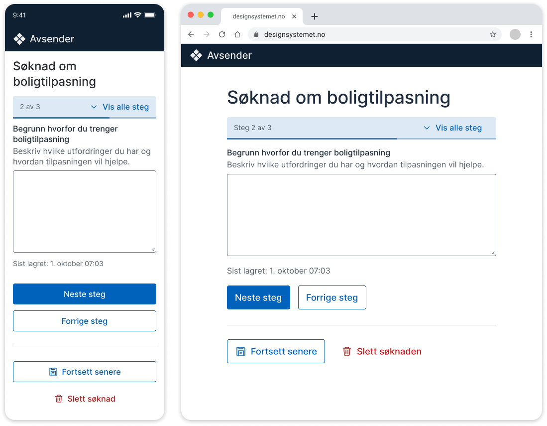
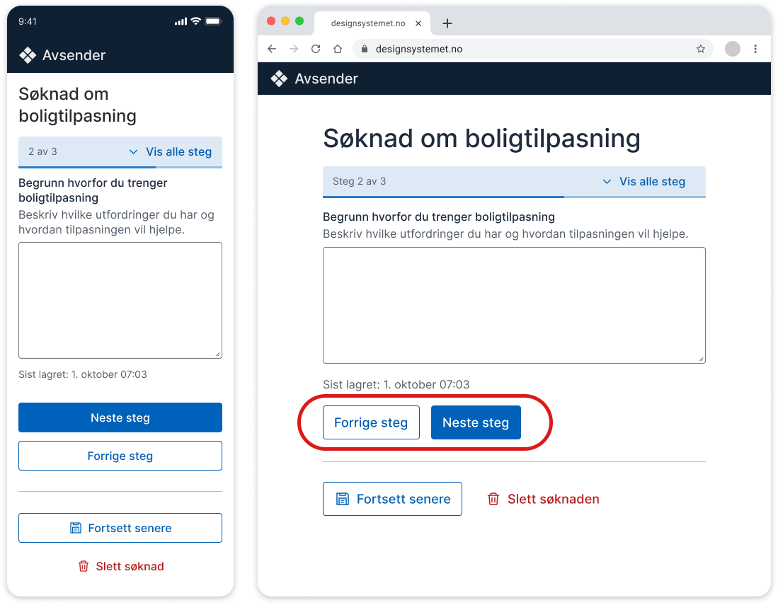
Multi-step form
Do not use a disabled “Previous” button on the first page of a multi-step form.3
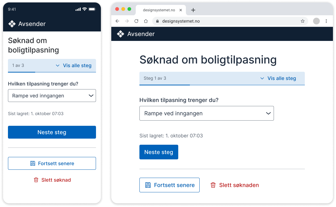
On the remaining pages, the “Previous” button should be placed near the “Next” button. Elements placed close to each other are perceived as related.4 Alternative actions such as “Continue later” or “Delete form” are different types of actions and should not be grouped with Next or Previous.
On small screens, “Previous” should appear below “Next”, following the main ordering principle. On larger screens, there are differing views on whether this rule should be broken. Some choose to prioritise reading and action direction, but there is currently no documented evidence that this is beneficial.
More insight needed
If you have insight into the placement of Next and Previous buttons, please share it in the ongoing discussion on GitHub.
If you make an exception, it should only apply to larger screens, not small screens where buttons are stacked. It is important that the visual presentation matches the DOM. This can be solved by adding an extra button that is hidden with display: none; and completely removed for screen readers. See code example with extra button (nav.no).
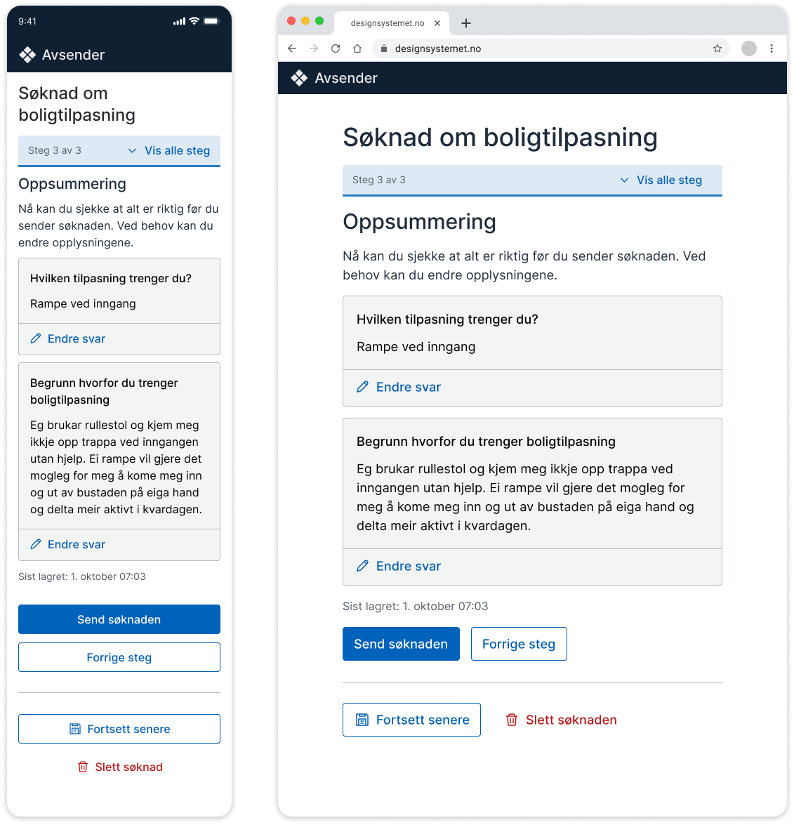
Final step in a form
On the final step of a form, it should be clear that the user is submitting the form. “Submit” is the primary button.
Language
Button text should always describe what happens when the user clicks. The text should be short and concise, ideally no more than three words. Use verbs in the imperative form, such as “submit” and “sign”.
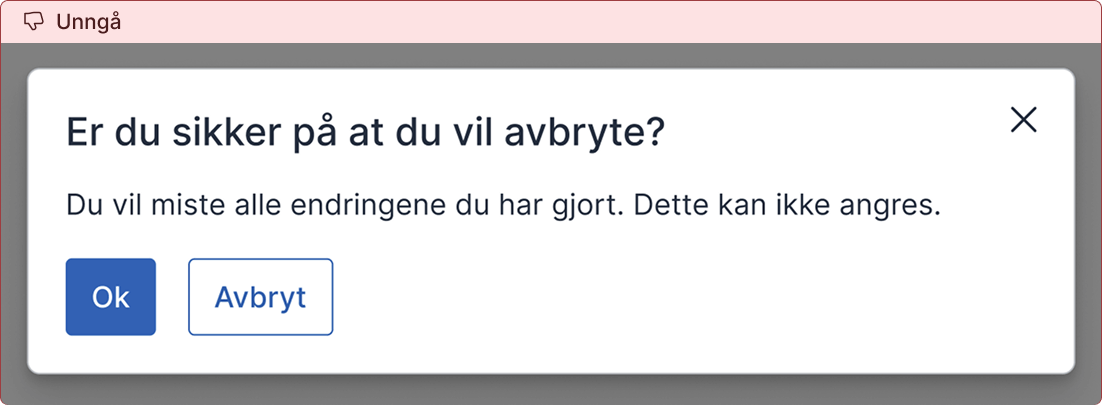
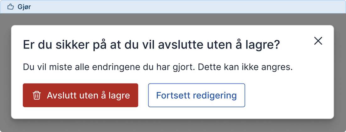
Avoid abstract terms such as “OK” or “Cancel” when there are alternatives that clearly describe what happens. Users should not have to interpret the buttons. It should be obvious what happens when they click.
Use the wording "Previous step"
Use the wording “Previous step” in forms instead of “Back”. This makes it clear that the action only takes the user to the previous step in the form, not out of the process.
Use “Cancel” consistently
“Cancel” should always mean that the user cancels an action without saving or changing anything. If there is a risk of data loss, consider asking: “Are you sure you want to cancel? Your changes will be lost.” When the function is something else, use terms that describe the action, such as “Save and continue later”. This removes the need for users to interpret what will happen.
Code
Focus order
The tab order should, as a main rule, follow the reading direction. This means that when a user navigates with the keyboard, focus should move through elements in the same order as they are visually presented.5-6
If “Next” is placed to the right of “Previous”, it may be tempting to change the focus order in the code so that users reach “Next” first. This should be avoided, as it creates unpredictable behaviour for keyboard users. It is better that the focus order matches the visual order. This provides a predictable and accessible user experience.
Relevant sources
- [1] Simplicity Wins over Abundance of Choice (baymard.com)
- [2] Understanding vision impairment
- [3] Disabled states (nav.no)
- [4] Proximity Principle in Visual Design (nngroup.com)
- [5] Understanding SC 2.4.3: Focus Order (w3.org)
- [6] 2.4.3 Focus order (uutilsynet.no)