Getting started
Preparations
What to consider when adopting Designsystemet in your organisation and solutions.
Designsystemet is designed to be used together with your own visual profile. You define colours, sizes, typography, and other visual properties through your own theme. You can create the theme using the Theme Builder. This gives you the freedom to use Designsystemet for everything from small internal tools to large public-facing services with strong visual identities. By using the foundational building blocks from Designsystemet, you can also build more complex components tailored to the specific needs of your solutions.
Designsystemet works like a toolbox. You do not need to use everything. Pick the parts that give you a boost in your own setup. Some teams use only the token structure, some use the React library, some use the CSS library, some use @digdir/designsystemet-web together with their own styling, and some only follow the guidelines. You can also combine Designsystemet components with your own components, change or build on top of selected parts, and skip what does not fit your needs. You decide what provides the most value in your context.
Designsystemet can:
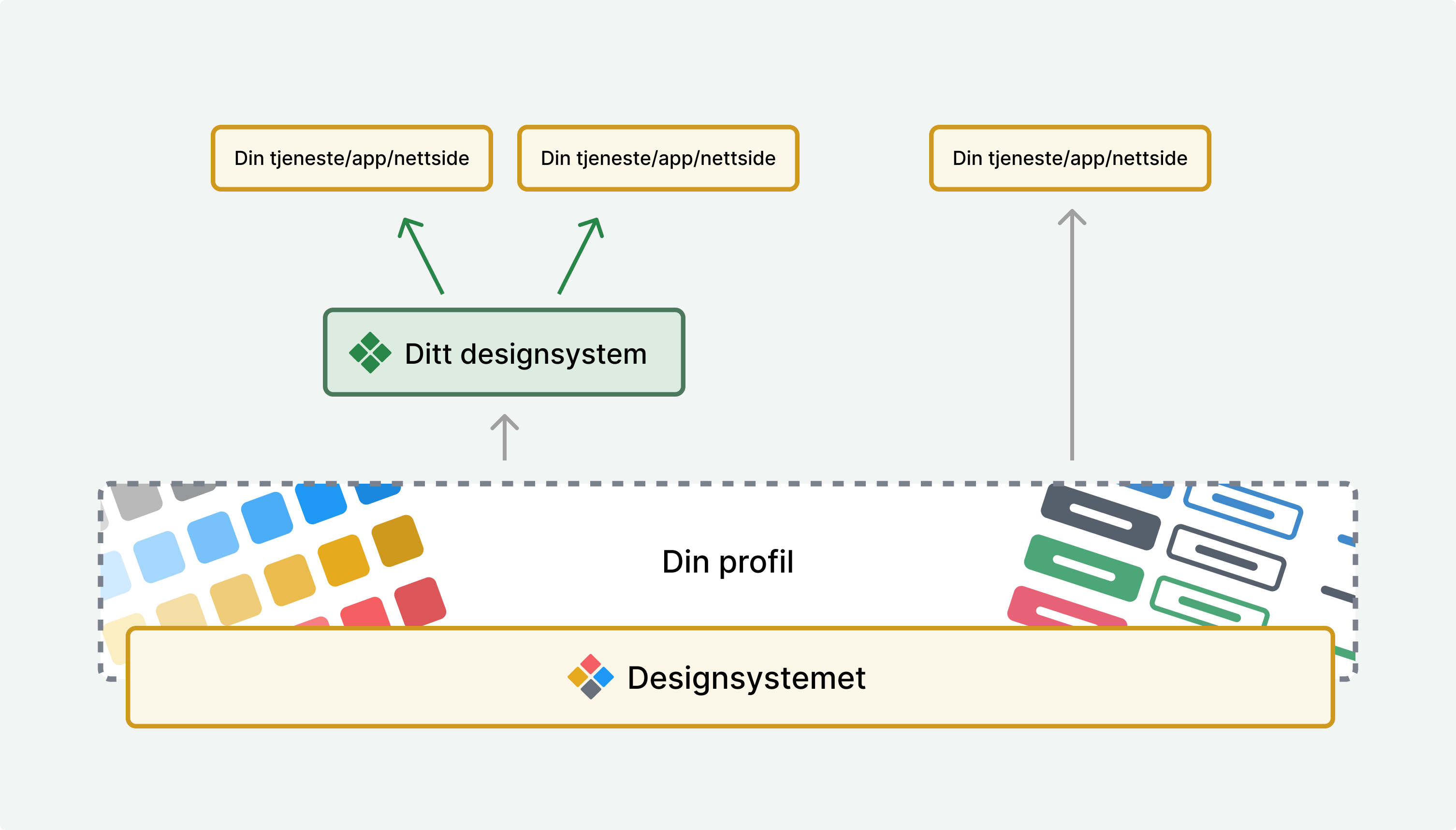
Use Designsystemet directly in solutions
Designsystemet can be used directly in your solutions by adopting the component library together with your own theme. This is the simplest way to get started and works well for trying out Designsystemet in smaller projects or for building simple pages and tools.
How to get started:
- Start by building your theme and store it in a repository.
- If you use Figma, you can use the Designsystemet – Core UI Kit, import variables from your theme, and publish the file.
- Follow the code package setup and choose CSS, the web package, or React based on your project’s needs.
- Import and use the components in your solutions together with your theme.
Use Designsystemet as the foundation for your own design system
The advantage of this approach is that you can reuse the underlying structure and all the foundational components, while offering your own more unique components as part of your design system. Establishing a design system requires an investment, but the ongoing maintenance effort is significantly reduced when you do not have to manage all the foundational elements yourself. With Designsystemet as a foundation, you can extend where needed and limit where it provides value. Examples of design systems built on top of designsystemet.no can be found at Utdanningsdirektoratet and Mattilsynet.
To succeed, you need:
- A dedicated designer and frontend developer who can set up and maintain the design system.
- A shared understanding across the organisation that a design system is a product that requires continuous work and is never “finished”. If you are considering building your own, you should ensure a clear commitment to maintaining it over time.
Below we describe a recommended approach based on experience from organisations that have already built their own systems on top of Designsystemet.
Theme
Start by establishing the theme to be used in code and Figma. The theme defines colours, typography, spacing, and other visual properties. The Theme Builder helps you create a semantic token structure, which you can adapt to your visual profile.
Code
A recommended model is:
- Use Designsystemet as a dependency.
- Apply your own adaptations as configuration on top, not as replacements.
- Avoid copying component code into your own repository unless it is necessary.
This allows upgrades to Designsystemet to be applied directly through version updates, while your own styling and configuration are preserved automatically. It reduces the risk of merge conflicts and makes maintenance easier.
To avoid making the rollout too extensive for the organisation, it is a good idea to launch components gradually and expand over time.
Figma
Designsystemet is shared as a community file in Figma. It is copied into your environment and becomes the starting point for your own library.
Be aware that:
- There is no direct technical link back to the original file. New versions of the community file cannot be merged automatically.
- Any changes you want to adopt must be transferred manually. In practice, this happens infrequently and is manageable, especially if you have made limited visual customisations.
A recommended practice is to:
- Publish your own Figma library based on Designsystemet. Place your own components in the same library, but clearly label what is custom.
- Retain the token structure from Designsystemet for colours, typography, spacing, radius, and semantics. Use tokens when building new components.
- Make visual adaptations based on your needs. Document what you have changed so updates are easy to understand over time.
- Remove any variants you do not want to be used in the organisation.
Documentation
A recommended practice is to use a website or Storybook for all documentation. Guidelines and usage should not be documented in Figma, as designers typically insert components via the Assets panel, and it is not a natural place for developers to search for guidance.
Many teams choose to:
- Use designsystemet.no as a shared reference for standard components and foundational principles, or copy parts of the documentation into their own surfaces, taking responsibility for ongoing maintenance.
- Establish their own documentation for custom components, adaptations, and guidelines, and extend it with pr
In short
- Use Designsystemet as a foundation, not a finished façade.
- Wrap it in your own Figma libraries and code packages.
- Build on it where you need to.
- Apply constraints where they add value.
- Upgrade regularly and in a controlled way.