
How the Norwegian Coastal Administration uses Designsystemet
The Norwegian Coastal Administration has built its design system "Styrbord" on the foundation from Designsystemet, and uses it as a shared starting point for new digital services.


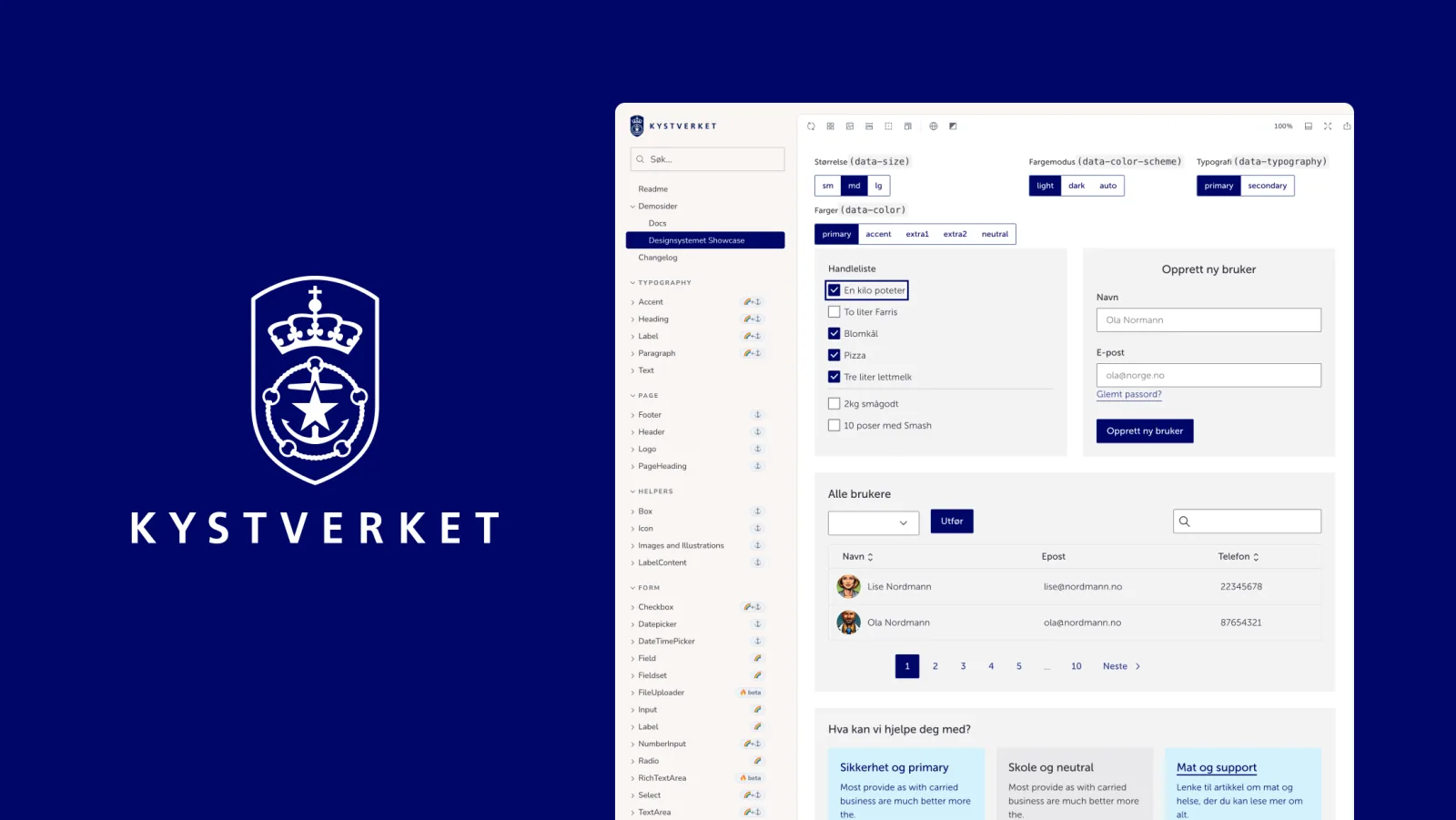
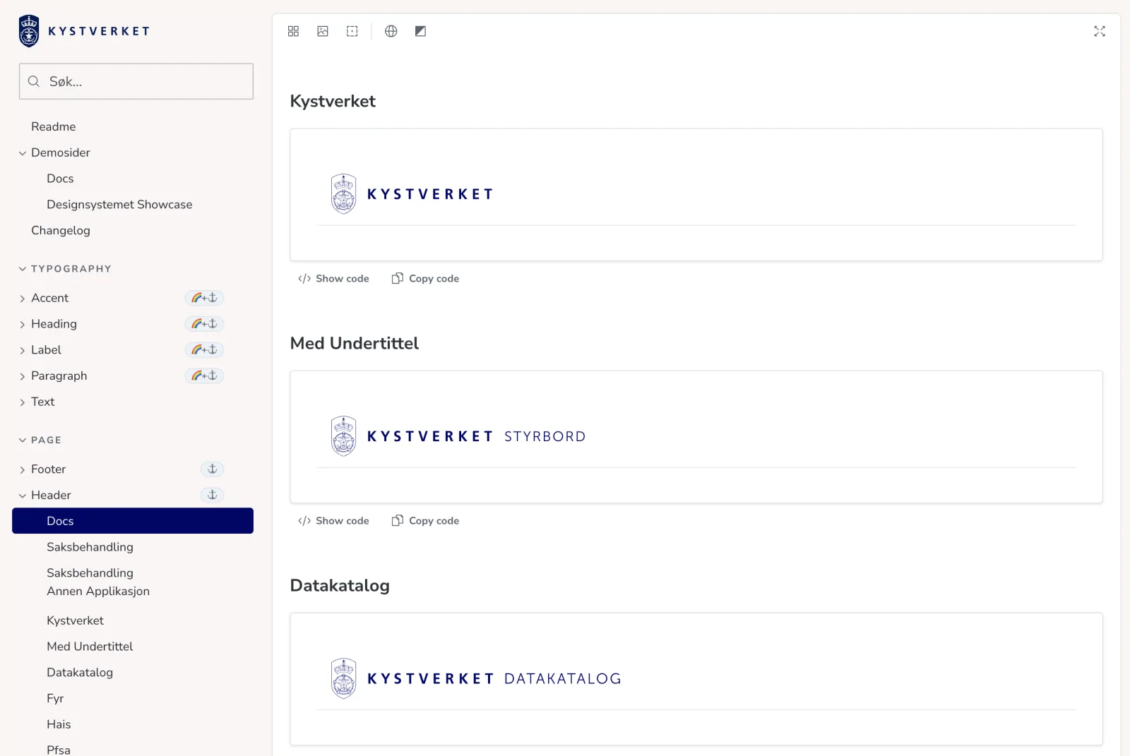
The Norwegian Coastal Administration has built its own design system, Styrbord, on the foundation from Designsystemet. In Styrbord, they have gathered their own components, patterns and profile adaptations for new digital services. Styrbord is publicly available on GitHub.
We asked them a few questions about why they chose to build on Designsystemet, how they use it today, and what they have learned along the way.
Why did you start using Designsystemet?
When we started working on a new application portal, we quickly needed a shared component library. None of us wanted to implement yet another button from scratch, so we first chose Mantine, which was a safe option at the time.
At the same time, we were following the development of Designsystemet, and quickly saw the value of building on a shared foundation for the public sector. When Designsystemet reached version 1.0, we started creating Styrbord and replacing the components we used, one by one.
We saw both the value of a shorter path to support and the strength of using the same foundation as other public sector organisations. One of the best things about development in the public sector is the culture of sharing and collaboration: our code is not a trade secret, but a product for society. That is why we see Designsystemet as a very good and relevant building block when public services are developed.
Where and how do you use Designsystemet today?
We use Designsystemet as the foundation for our own component library, Styrbord, and now require it in all new projects, both internal and external. We also encourage older projects to adopt it where it makes sense. Recently, we had more than 15 summer interns developing different prototypes over seven weeks. They all used Designsystemet through Styrbord, and it was very positive to see that the solutions had a consistent expression and clearly appeared to be from the Norwegian Coastal Administration.
Concrete examples of services where we use Styrbord are:
- Selvbetjening, where users can submit applications and notifications
- HAIS, which is used to order extracts of historical AIS data
- Kystdatahuset, which provides access to maritime traffic data
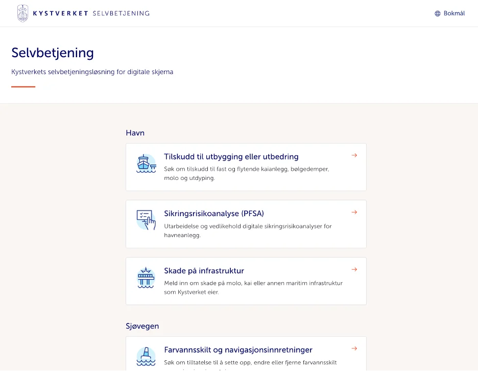
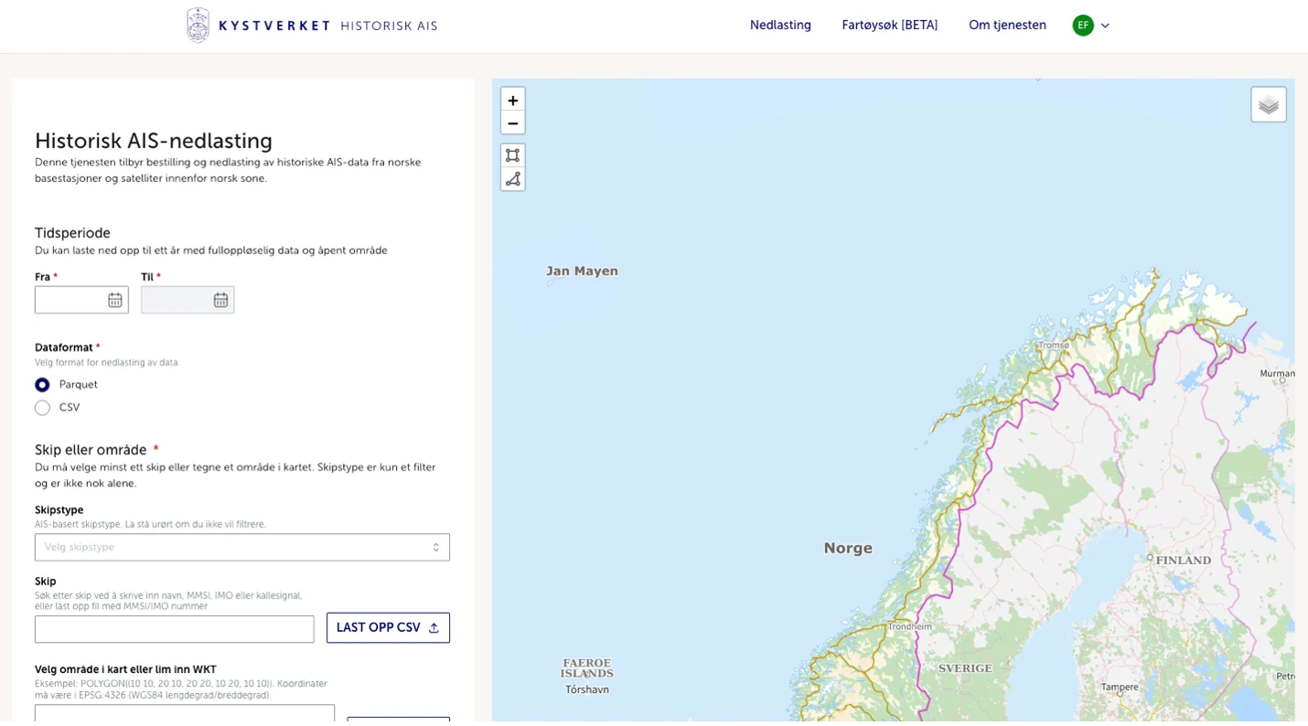
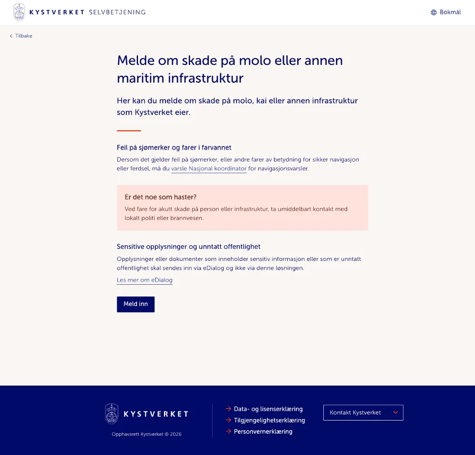
How have you adapted Designsystemet to your own visual profile and needs?
We have worked especially on colour adaptation, because the Norwegian Coastal Administration's primary blue does not translate directly into a regular colour scale. We have therefore adjusted the colour scales manually where needed. We have also adapted the fonts to what we already use on the website, and reduced the font size by one level.
Some components have been extended with more options and variants, such as buttons with striped borders and avatars with more colours and border types. Other components have been built with Designsystemet as a starting point, such as our DatePicker. It uses an Input with the type date, and adds a button that opens the built-in date picker where possible.
In practice, we see Designsystemet as a solid foundation for our own component library. It gives us a shared starting point, while still allowing us to offer more adapted and specialised components. Designsystemet naturally needs to be somewhat conservative, while we can allow ourselves to create components that are more specialised, and sometimes a little niche.
When developing new components, we increasingly ask ourselves: How has Designsystemet solved this, or how would they have solved it?
What do you see as the biggest benefits of using a shared design system?
When public sector organisations build on the same design system, they get a shared foundation for user experience, while still having room for their own visual expressions. When we gather around shared patterns and guidelines, services become easier to recognise and use. It also gives us a kind of competitive advantage that we can collaborate and share experiences across agencies and public sector organisations.
The biggest benefits are that developers need to make fewer design decisions and can spend more time on functionality. In addition, we have solid documentation to point to, which makes it easier to onboard consultants and new employees, and to ensure that we use the same principles for components and style. A shared expression also contributes to unity in a large and varied organisation.
What has been most challenging?
It has mostly been unproblematic to adopt Designsystemet. The things we have particularly had to solve ourselves are top menu, navigation, maps and forms. Forms are their own discipline, with everything from validation and summaries to good feedback for the user.
One thing we have missed, and therefore built ourselves, is a component for stacking and grouping other components. Mantine, for example, has Stack and Group, while we have made our own variant, Box. In practice, it is a flex container that makes it easy to set basic flex rules such as direction, gap and padding. It would have been useful to have a shared component that could, among other things, provide standard spacing between components in a form.
What would you like to see from Designsystemet going forward?
Although we always want more components, it would be at least as useful to have even more good guidelines for best practice in user experience. We would also like more support for composing components.
Another wish is a better way to use the good documentation that already exists, but with our own adaptations. When we built our Storybook, we took a shortcut by copying stories from Designsystemet and adjusting them where needed. That works fine once, but becomes heavy to maintain over time. We are unsure exactly how this should be solved, especially when we have added our own options and variants.

Contributors